This week, I finally completed the migration of my French website. And it's been a JOURNEY.
It's been on my mind for a while to quit Podia (affiliate link), with which I was for years, and build my website from scratch somewhere else. I wanted more freedom, more fun, more experiments. So when they announced they were becoming a community-first kind of platform, I decided it was time. There's too much social media as it is, I don't want to turn my business into one (but that's not the topic here).
I had already dipped my toes a few times into AI-HTML. Mostly to make slides, and then, as a bigger experiment, to make a simple website for my parent's guesthouse. And tha, as an even bigger experiment (yet still modest in its ambitions), with this website.
I was READY to make something better, bigger, bolder for my business. And my objective, as I put it, was to 'wow' visitors. Aligned with my whole argument that creators should aim to delight and enchant people online.
Looking back, I think this is an extremely BAD objective for a website.
First of all, because it's a lot of pressure on a new thing you haven't even build yet. And second, because... that can make you lose sight of what the website is for. Concretely, it made me launch into a several week-long process of creating something I thought was edgy and cool, and then ending up hating the design, the color and the whole concept after a couple of pages had been finished.
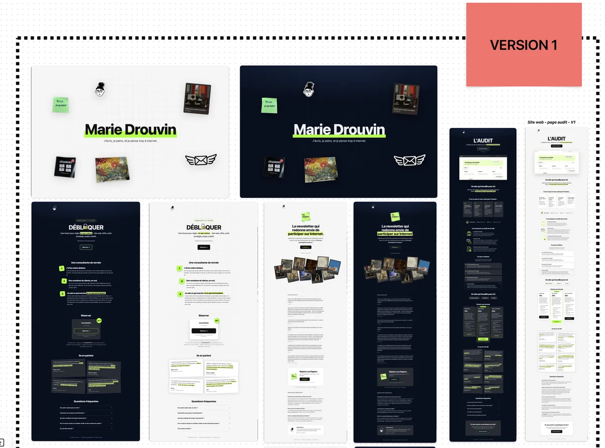
I started with something simple : white, with neon. These have been my go-to colors for a while on my business related projects.
Things started well, and I had A LOT OF FUN coming up with ways to make each page feel interesting in its own specific way :
- the audit page had an animated illustration that changed along the visitor's scrolling
- the consultation page had an emoji change easter-egg
- the papier page had a collection of Substack cards
- ...
But things got weird as soon as I tried to make it more accessible and add a dark mode. It felt suddenly very... tech from 5 years ago. And as much as I tried to shift the colors (last iteration had a blue background in dark mode), I was NOT satisfied with the vibes. So I decided to start over.
For this second version, I'd try to add some of my signature style : organic reminders. I played with vintage stationary colors, bristol cards and cork board. And let me tell you : I LOOOOVED working on that. It was fun, I kept some of the effects of the V1, adding some new tricks to my collection of website tricks and really pushed myself in terms of color and dark mode.
It felt a lot more like my vibe.
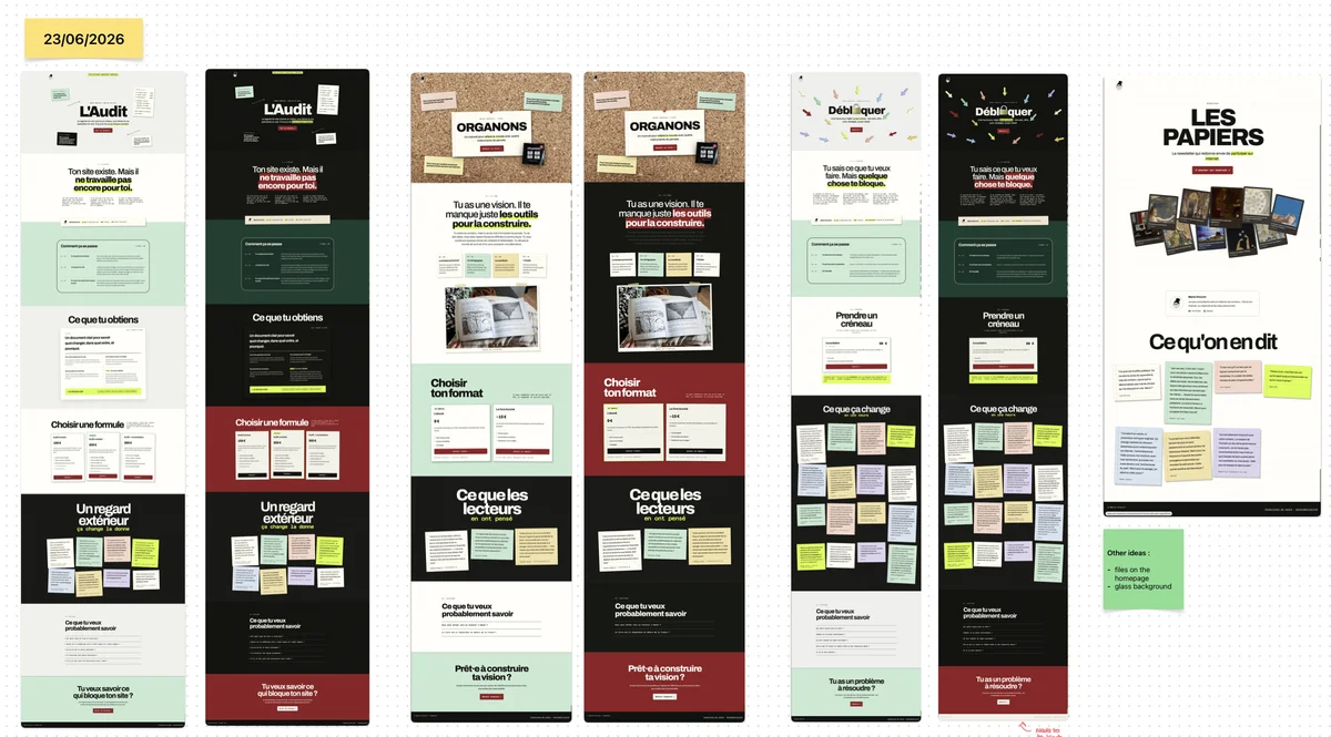
And looking back, it is stunning (especially in dark mode). BUT it was a nightmare to edit. Everytime I was adding a new page or a new block somewhere, I had to check everything twice. I tried very hard to guide the AI to understand what I needed, going as far as making a whole menu of blocks and how they should behave in light and dark mode.
But after two weeks, I figured : this is way too much work for a website I'm bound to keep adding to. And I was already kind of tired of the colors...
So I took a little break to think things through.
What is it I really need my website to do :
- help people find my offers quickly and understand what they can do for them
- be a place where I can add stuff easily
- and what those weeks of testing and trying out designs told me : be a place that I can evolve in visually too
That last part was important I realised (maybe not as important as the first one short term, but long term? yeah).
So I started to think about the places I never get bored of.
My computer being number 1. It's a good place to try to emulate, because the interface is pretty strict. I can change things around but not too much. So i started to think about how I keep my computer a place I want to come back to :
- switching backgrounds
- changing the main color of the interface
- dark mode / light mode (also a bit fan of the color filter when I'm overstimulated)
Not so long ago, I shared here a website that I really liked that looked like an apple computer (june 2026 online life snapshot - alanagoyal's website ). It really sticked to my mind.
Obsidian is another one of those places where the interface can be pretty stiff and yet, with a couple of edits to its appearance, I'm inspired again.
So I had a new, much better list from which to work from :
- easy to add content to (simple structure that an AI cannot fuck up)
- easy to modify when my mood needs it
- dark and light mode (that was always a thing anyway but, it needed to be more obvious)
And from this list, my V3 was born.
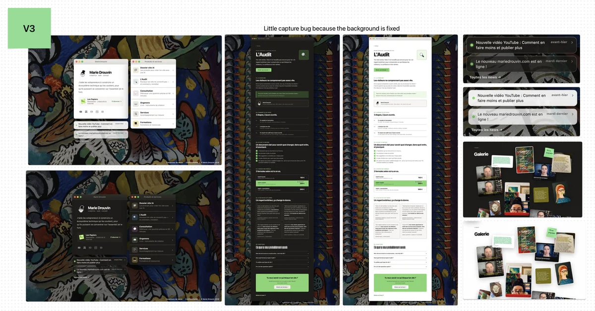
In this version, i can easily :
- change the accent color (it's a global parameter)
- change the background (same principle)
- change the fonts (same)
- add notifications to the homepage without having to add a whole news block (I only have to edit an md file)
- each page is dead simple, and easy for clients to get the info
- yet, I kept some whimsy wow effects with a gallery and the notifications (but they don't get in the way of someone looking for info)
- and it is super convenient on mobile
It's a living thing I can add to easily. Without having to fight with Codex or Claude over every single little details. And the best thing is that it's super light. For now, I'm very into this Kandinsky painting, but who knows, tomorrow it could have a totally different vibe with a vintage picture, an AI pattern or a painting of mine !
I'm very proud of this version. And I don't regret having gone through all the different iterations of design, I've learned plenty of tricks and principles on how to make AI do exactly what you have in mind. And I really upped my accessibility game ! But maybe that's another post.
You can check it out here : mariedrouvin.com